

Help!
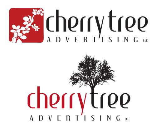
I need your help with something if you have a spare moment. Yes you. I am starting a new advertising/promotional products company called CherryTree Advertising. I've designed two different logos, and I'm having a hard time deciding between the two. So, if you have a moment, please tell me which one you like better and why.
posted by Cristina | 10:12 PM
![]()
10 Comments:
i like the 2nd one. Simply the tree does it for me, and i like the distinction between the words due to cherry being red.
First off, Congrats on the new business! Sounds like it will be a lot of fun.
They both look great! I love the font you chose and the tone of red. the first one feels a little more formal than the second to me, somehow. Maybe because it has a more standard, rectangular feel to it or something. My eyes feel more accustomed to the shape of it.
The second one is definetly a lot of fun and creates a unique, realistic attraction with the tree, yet the logo maintains a "serious" aspect. Maybe I like how the tree kind of "grows" out of that rectangle I was talking about in the first one.
I'll quit jabbering and will also vote number two. Good work!
I like them both, but I think the first one best. I think the first one looks more feminine, and the second more gender neutral.
tina i like the first one !!!love you it's zoey.
They both look great! Congratulations on the new business. If I had to choose- I'd say the first one. It's more exciting to me :-)
Hi Cristina!
Sorry it took me so long to check out your blog and your logos. Did you decide on one yet? I love them both but I lean more towards the 2nd one because it's more funky and fun. How is it all going, by the way?
Hey Cristina, It's true, they both look good...
but I think the first one looks more professional while being creative. It looks sophisticated and has a good symmetry. I think it would print really well on any publication.
the second is very creative as well and seems more artistic but is also risky. Because of it's odd shape it seems like there might be too much going on for a logo.
I hope that's helpful. I'm looking forward to seeing more of your stuff.
I just stumbled across our blog, so I'm a total stranger whose opinion is solely based on what I observe and not anything else.
I think the second logo design is better for the public. At least, speaking as a guy. I find the first logo to be too feminine. Flowers, even if they are cherry blossoms, make me think that the company will just be good at feminine designs. I'm just being honest.
My vote is the second design. It doesn't have the gender bias and it's a very nice twist on the word, "tree."
A second reason I like the second design is because the color (red) is used in the name. The eye naturally goes to the color, so in the first design I'm drawn to the cherry blossom graphic and in the second design I'm drawn to the business name. That's what you should want -- call attention to the name.
Good luck on your new business!
Cristina.....How've you been?
Small world!! My name is Christina Cherry, I had a webdesign business called Cherry Tree Web Design!!!
Post a Comment
<< Home